label design + winery rebrand
played a pivotal role in the rebranding of the historical rotta winery and designed labels for the new wine brand, midpoint. focused on developing a concept that evoked the spirit and energy of the brand - telling the family’s stories through art in a fun + light-hearted way.

each wine SKU has a unique theme that will stay consistent over time for recognizability, but has the ability to change each year with new photos and doodles.
design process
brand discovery
type of wine being made
lighter-bodied
yet complex
drinkable
somewhat experimental
mid-pricepoint
the overall midpoint guest experience
where people come together
to ferment friendships
spurs curiosity
and learning
all about the here + now
determined the new brand’s identity
fun + fresh
but not overtly trendy
authentic
reflecting the history of rotta + paso
not too serious
approachable + un-pretentious
preliminary design brainstorm
messy mockups + creative direction ideas that led to the final concept (made before we decided to switch the name from Rotta to midpoint)
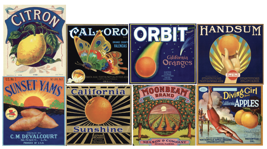
labels inspired by vintage fruit crate art - a nostalgic energy while feeling authentic + fun. would give a lot of creative freedom in design and wine names

.01

black + white, western-inspired. an ode to the historic and present energy of paso mixed with some edge + contemporary elements

.02
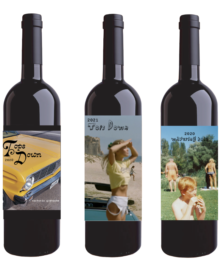
using film photos, the main idea being that each SKU will have a theme (i.e. cool car) that carries through vintage to vintage but the exact label will change.
.03

doodled over this photo… and we knew. this concept was the winner.

INITIAL design DIRECTION

final bottle design
-
![]()
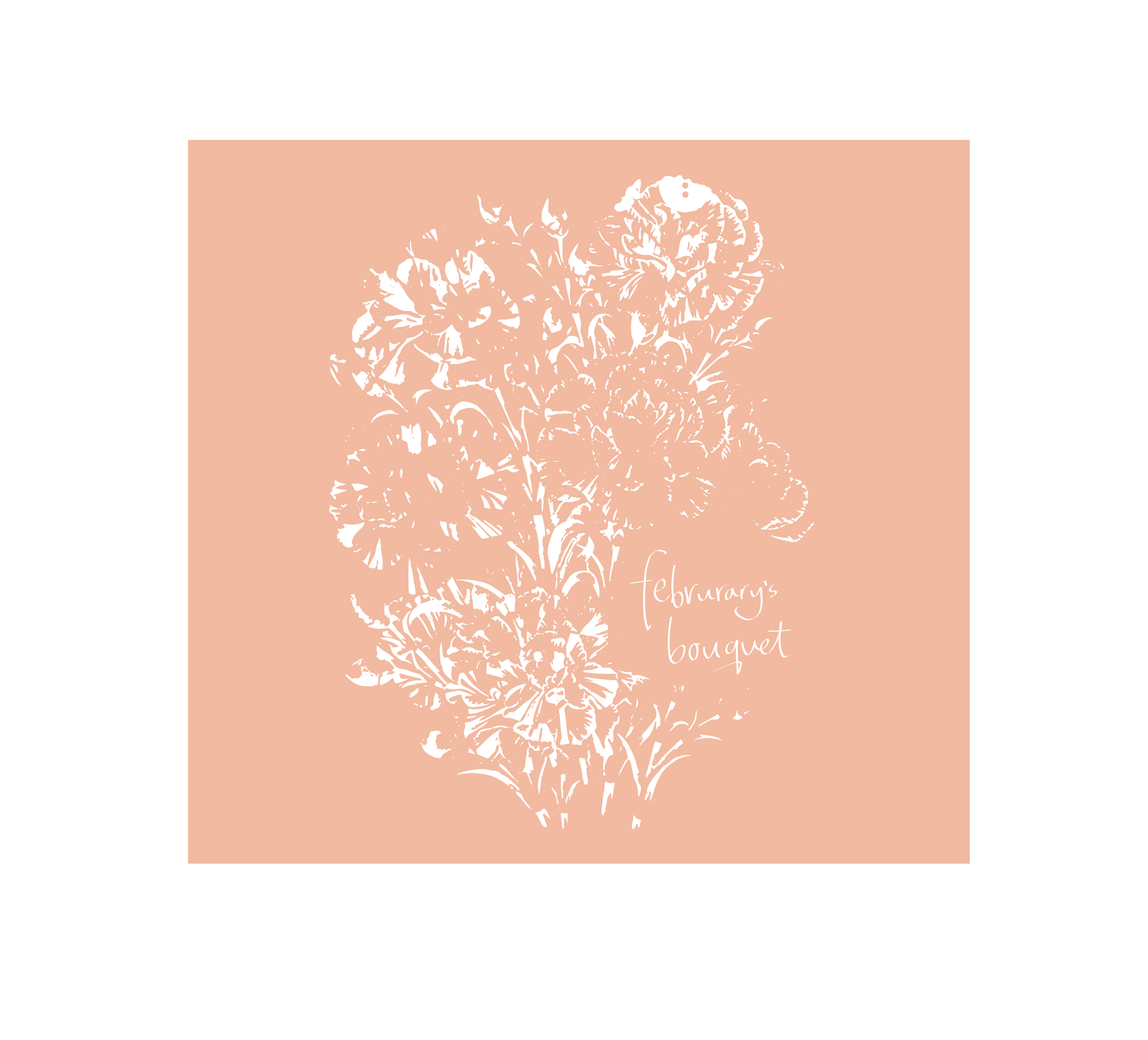
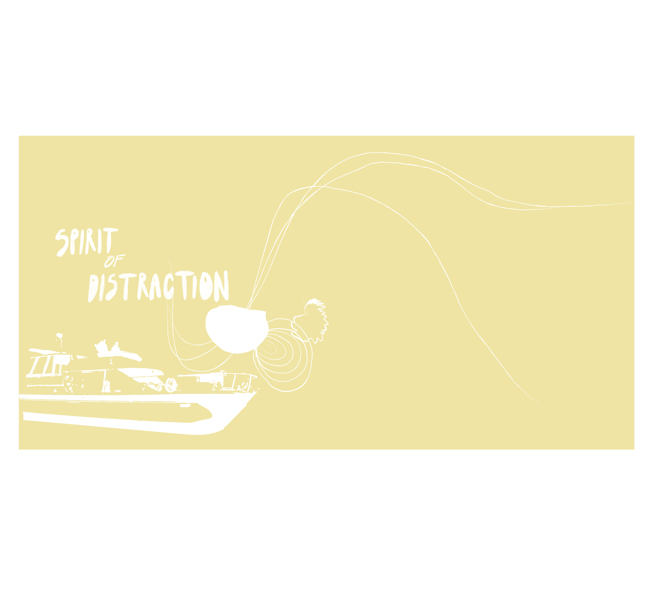
spirit of distraction
-
![]()
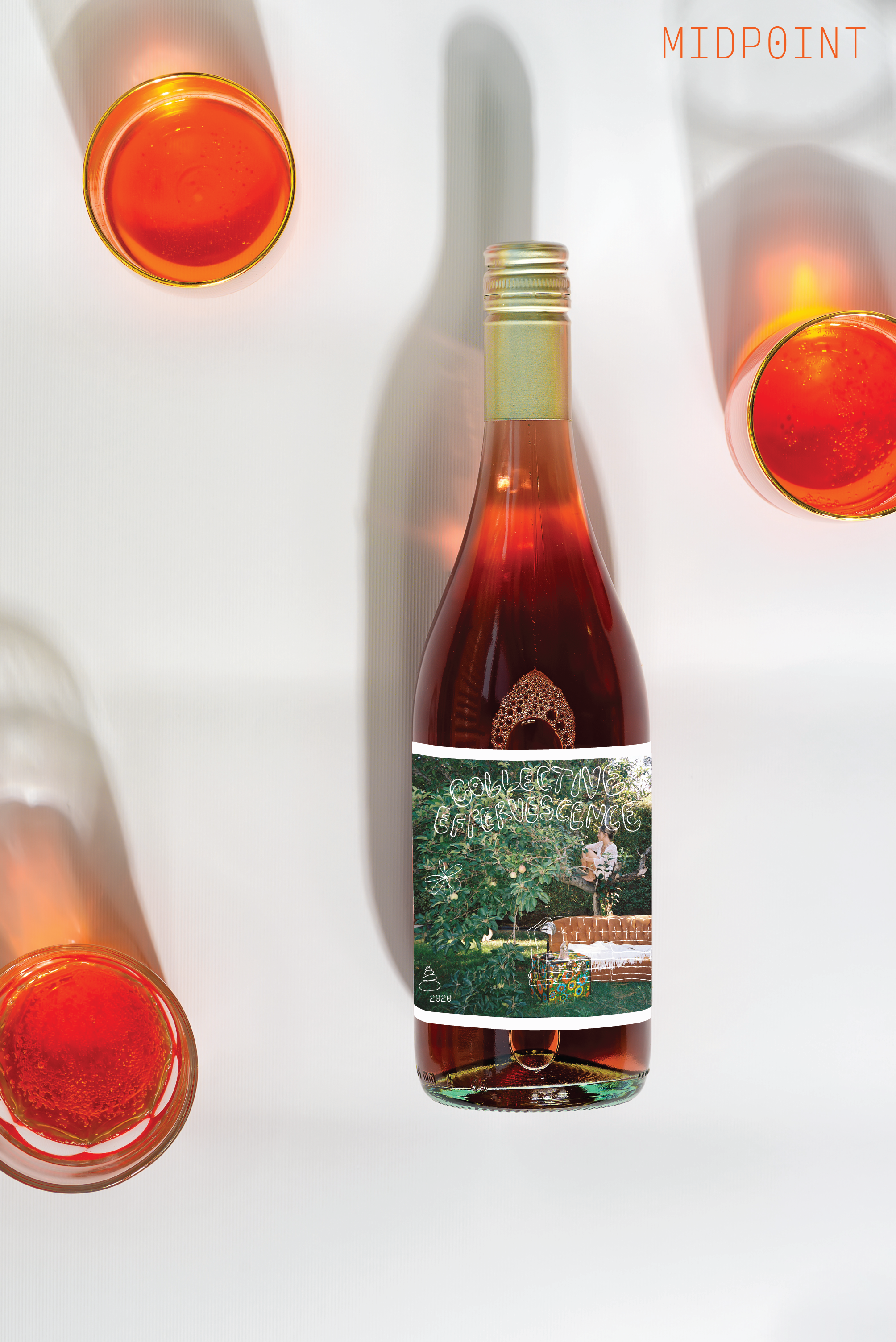
february's bouquet
-
![]()
no forwarding address
-
![]()
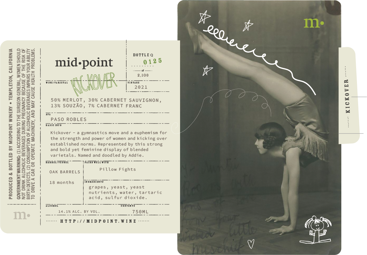
kickover
-
![]()
rotta zin
-
![]()
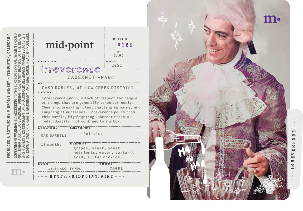
irreverence
-
![]()
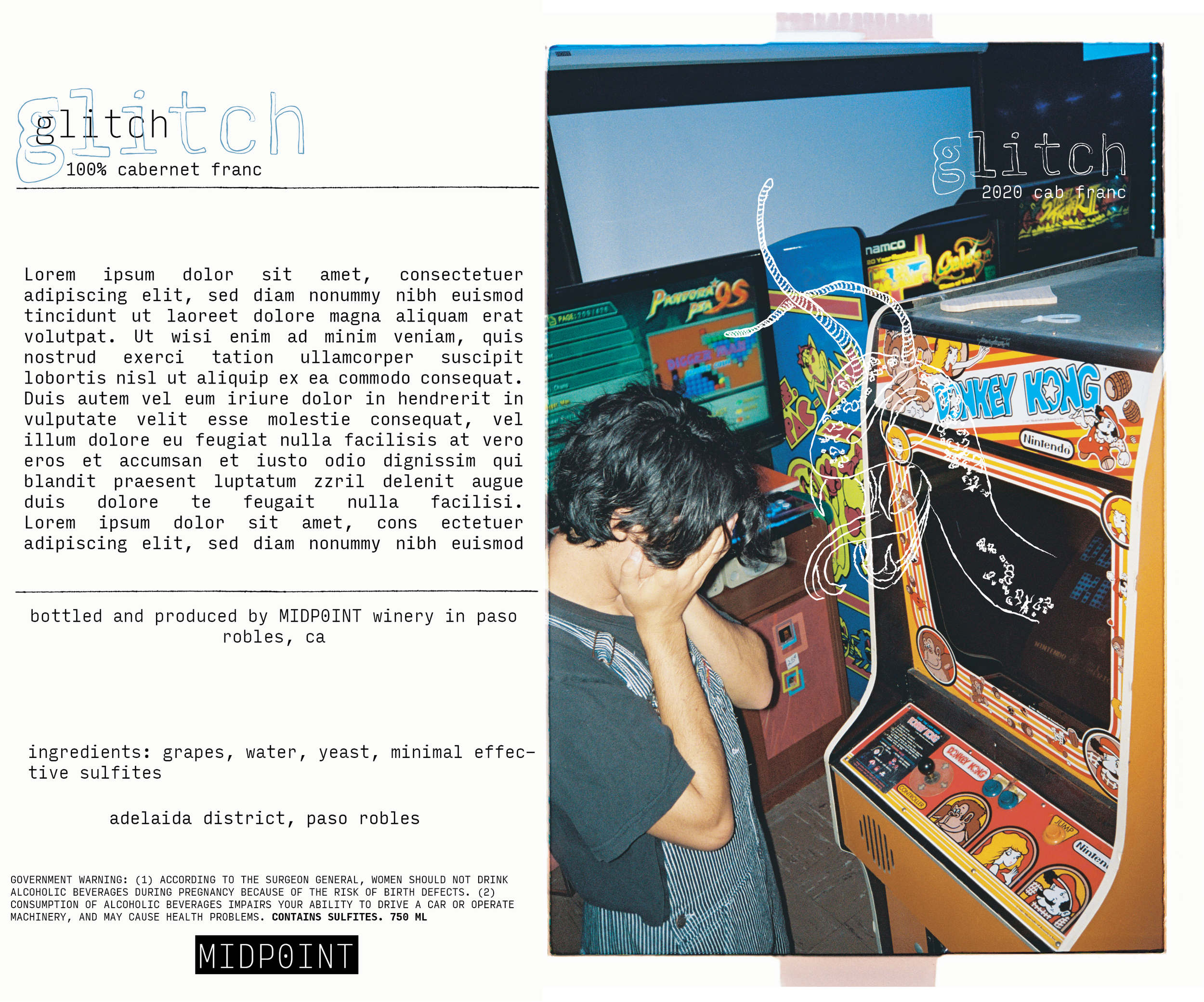
glitch


label close-ups


project
Services
copywriting
created fanciful names, embodying the essence of each different wine, spirit of the brand, and elements of the family’s story
determined what information should be present on the back label, deciding on something informative yet fun - including some nerdy facts and a creative blurb
wrote all back label content to summarize the story of each wine, connecting the wine to the photo and fanciful name choices in an engaging way for the consumer
graphic design work
created the concept for the new brand logo
creative direction and development of the wine label concept
wine label design for 6 wines, sourcing photos and creating doodles for each, utilizing Illustrator + Photoshop
final label composition produced by a firm the winery already had on retainer, in which i consulted for the final product
consulted on…
the new brand name, choice of bottle style
interior design and flow of the new tasting room
business strategy and wine club structure
the transition from the original rotta brand to new midpoint brand